The top 5 outdated logos and why they need updating
Even though your brand may be well-known for its goods and services, how people see your company as a whole is what really counts. Customers’ interactions with your brand are what lead them to discover it, and your logo will be the first thing they see. This keen eye of a customer is the reason behind many logo revamp decisions.
The big Kahunas in business are no different. They often find themselves in situations where they must update a logo for a whole host of reasons. This could be so that they can continue to stay on brand, perhaps the business has launched a new product line, or the business needs to modernise its outward branding. Some businesses just have down right bad logos that are desperately in need of a revamp.
Let’s take a look at what we think are some of the most interesting examples of how major businesses have updated their logos to help fulfil their individual business goals. Lets get our logo revamp on:
Apple’s Logo Revamp
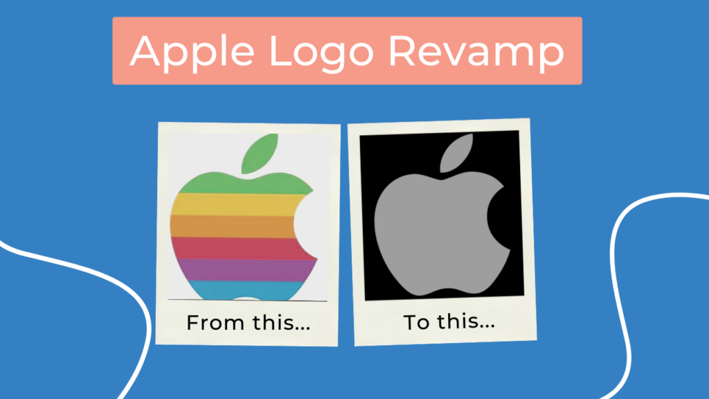
Apple’s logo is one that has changed time and time again over the years and is unrecognisable now compared to its original concept. Oftentimes, Apple has developed its logo to explain how it’s innovating the industry, such as its rainbow hued incarnation that was made to show consumers how the company developed the first monitor with a coloured display. Now, the logo is extremely paired back compared to its original, with a sleek, polished design that is instantly recognisable. Apple is an example of a logo we all know very well, yet has been constantly updated to move with the times.

Olive Garden Logo Changes
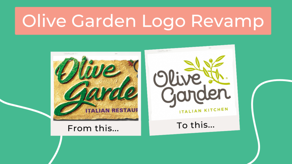
Olive Garden took a slightly different approach in updating their logo, describing it as “the symbol for our brand renaissance.” The new logo was designed to get away from the older stylised olive vines and modernise the whole logo with a more easily readable and up to date font. The new logo looks much fresher and seems to be more in keeping with other similar establishments. Olive Garden’s logo revamp was met excitedly by patrons who were happy that their favourite restaurant was updating and modernising, rather than changing what they knew and loved.

AirBnB Logo Changes
Airbnb not only relaunched their logo, but took on a whole brand relaunch. The brand hoped to get away from some of their past criticism, but it had mixed results. Some of the internet told us it looked like boobs, the other half praised its better colour choice and bolder text. And we can kind of see where both sides are coming from! The Airbnb logo is a good example of how rebranding sometimes does not go to plan and that every aspect of the design needs to be thought about in order to produce a logo that the public love.
Peugeot Logo Revamp
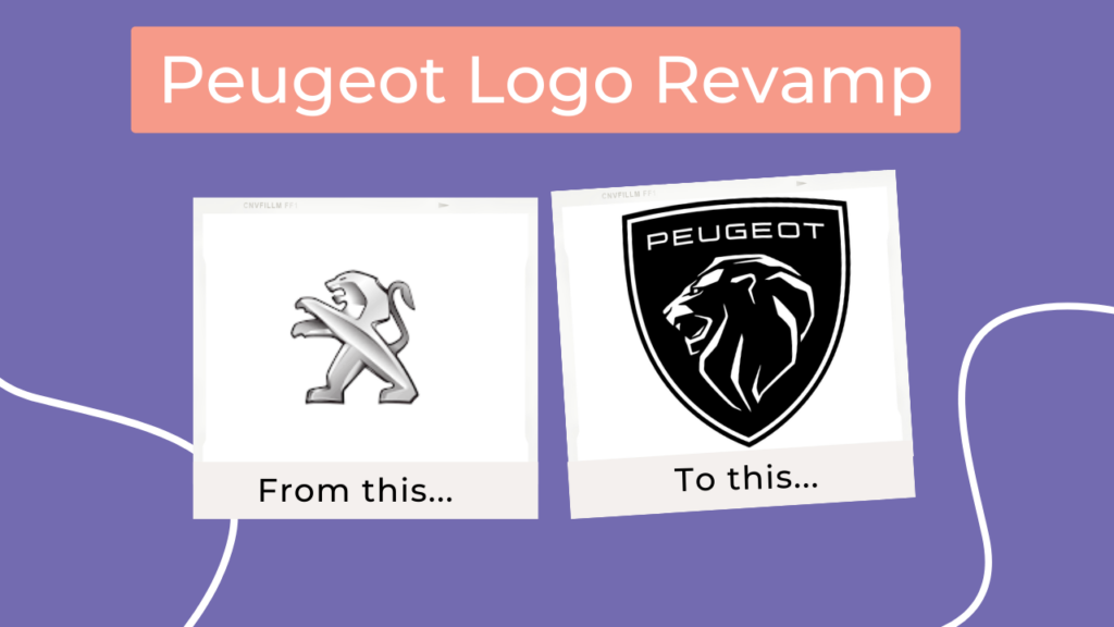
The new Peugeot emblem, which incorporates a lion’s head, represents a change in focus for the automaker. This is the first time the car company has altered its logo in the last 10 years. The change in the logo was designed to better reflect the type of vehicles they want to be known for. The new logo is much bolder than the previous one, this is because the designers wanted it to be more in line with the bold and simple logos of popular car brands such as Audi, Tesla and Mercedes- Benz.

Burger King Logo Changes
The new Burger King logo seems to have gone back in time! The older Burger King logos from the 1970s and 1980s served as inspiration for the new one. The designers of the newest logo were inspired to choose a more retro design. This took place when Burger King was beating McDonalds in the fast food race in the States. The new logo is more organic and represents the brand’s shift away from artificial colours and flavours. The synthetic blue swoosh going and being replaced with more natural block coloured hues.
The 5 logos we have mentioned are all excellent examples of why updating your logo can be done for different reasons and with mixed receptions. One thing is for sure though, whilst updating your logo may be met with mixed response, a logo revamp will breathe new life into your brand and providing you use your brand voice throughout, you will find it to be an exciting experience for you and your business.
If you want to learn more about the best ways to keep your branding consistent and how to store and share your logo, get in touch with us today.
